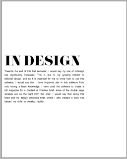
The final 'logo'
I liked this design as my final logo, I liked the range of weights it contained, and the type is formal yet stylish, I made the line longer in the middle and to me it almost represents a double page, something I love to look at and create.
Final Work
Pack...
I used black paper for my stock, as well as pearlescent stock to line the inside of the pack. I also used a lot of foiling, and foiled all my contents. I feel that the black on black is sophisticated and modern. I also like black and white design and so I feel my colour scheme is appropriate. I foiled as I felt it adds another texture, one that is quite glossy/ glamorous and so quite editorial, high end.
Contents
- Concertina (& belly band)
- Publication
- Card
Presentation of Pack
Card
 |
| Front |
 |
| Back |
Publication
Concertina


No comments:
Post a Comment