The Brief
Produce a range of self promotional material for delivery through print and electronic media. You will be expected to produce:
- Print based portfolio of work
- An appropriate online presence
- Personal branded CV business cards and stationary
- Any other material appropriate to the promotion of your design practice or stated progression strategy
I like this branding because it is very minimal and sophisticated. I like the fact that there is a logo mark I think that this works well with a name and the two can work over a variety of formats.
Design by: Anti, Norway
http://anti.as/projects/?anti=design
| http://www.underconsideration.com/brandnew/archives/new_logo_and_identity_for_acapo_by_anti.php#.UwQATEKSzfk |
I like the stock choice and the foil really stands out it looks quite bespoke and I like that the envelope is the the same foil colour.
The type work well on the back of the business card and there is a subtle hint of the foil.
Again I like this identity as it is minimal, I think that this may be a little bit too minimal for me, but the print costs would be quite low as it is just black ink onto stock.
I like the way the name has been made into an pattern through the letterforms and then applied to other aspects of the stationary I think that this is quite interesting. The emboss also looks good and creates interest.
Designer: Ryan Romanes
Client: Jason O. Stevens
Printing: Moo.com & Stich Press
 |
| https://www.behance.net/gallery/23935247/Jason-O-Stevens |
I really like the colours of the stock etc used for this identity. Again with a foil finish the stationary looks more considered, and it stands out. I also like the way that the type isn't black, its really in keeping with the brand and it has a softer finish. I think that the silver foil on the darker grey works better than the one above.
Design: Two Create, London
 |
| https://www.behance.net/gallery/15608645/HOUSE-OF-THE-NOBLEMAN |
The stationary also appears to have a border when the main colour is white. This isn't an effect you see often and I think that it again adds more consistency to the brand.
I also like the button effect but I think that this would be impractical for a large scale commercial print, it would be expensive and fiddly to actually tie. I don't like it at the bottom of the envelope either this is impractical too, but they have considered this and created the smaller standard envelope. I like this more as it is sophisticated.
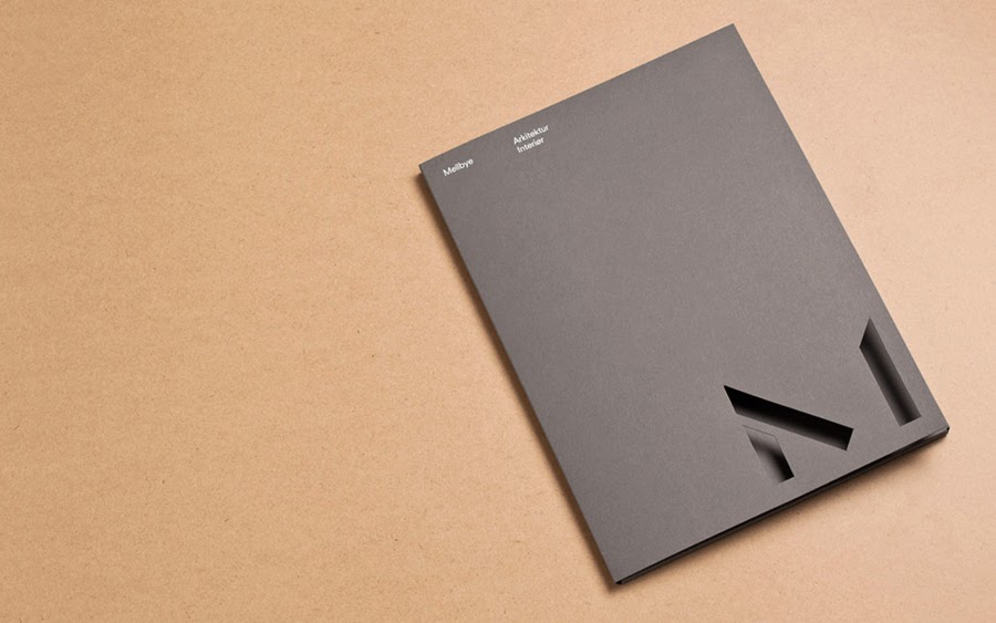
Again another simple but effective logo mark, similar to the JOS branding, using a combination of the letterforms and space.
They have used a combination of embossing and laser cutting, which means the colour of the stock is the focus. I would rather use one or the other, especially as it would add cost for me.
I don't really like the colour of the identity and I wouldn't consider using a brown but this is suitable for the client in this instance.
Design: Heydays, Norway
 |
| http://bpando.org/2013/12/17/logo-mellbye-architecture/ |
I like the small mark on the top buisness card I also like the way the copy is laid out on the buisness card, but I dont like how the name has been written over the top in yellow there is a mixture of styles and the brand is unclear.
 |
| http://www.fromupnorth.com/ |
 |
| http://www.fromupnorth.com/ |
This is very sophisticated and stylish, I think that the stationary is very consistent and simple.
 |
| http://www.fromupnorth.com/ |
I like the colour combination of this branding, I do think it is very feminine and I would try avoid this in my own branding. I like the foil finish and that the copy matches the colour of the stock on the back.
'these cards were foil blocked using fluted dies to create a raised impression, then duplexed with two contrasting sheets of paper – 350gm Curious Touch Nude and 540gsm Colorplan Frost with fabric emboss.'
Design: Team Impression, Leeds
 |
| http://www.team-impression.com/news/ |
Focussing on the type alone I like the capitalisation of the letters and I like the under/over line on the 'A' I think that it would work well on its own and with the type. A downside is that it may look unbalanced with just the type.
Design: Sociedad Anónima and S – Design Consultants
 |
| http://www.logoed.co.uk/2013/03/14/archivoi/ |


No comments:
Post a Comment