Thursday, 19 December 2013

Studio Baer


http://studiobaer.com

I came across this studio when I was looking at some editorial work, on designspiration. 

I looked into the studio and found that a lot of their work was editorial and publishing, which appeals to me, and especially their style of work. As well as this one of their main focuses is fashion and this appeals to me too.


I like the simplicity of their work and the layout of their publications, I will keep looking into their work.


Studio Baer
11 Elm CourtRoyal Oak YardLondon SE1 3TPStudio: +44 (0)78 11635217info@studiobaer.com


Friday, 8 November 2013

Peer Review 5/11/13

5/11/13

As a group we decided we would discuss our print brief firstly and our web brief secondly. 

Print
As I had only a vague idea and a few scribbled drawings and notes in my notebook, this was the only thing I had to go on, but I felt it was a starting point and I had a small idea. And so I discussed this idea to the group- (and I had to show them my scribbled notes) I should of really formalised these thoughts in preparation. 

Anyway the feedback I received was quite informative and gave me more of a direction, from this feedback I derived a few things that I need to consider ...


  • I need to aim at students who already have a vague idea of creative processes and print, people who wish to learn more
  • it doesn't need to be a step by step guide, if they want to learn how to do it they will go and do it 
  • I should have a look at a pantone book
  • And I should have a look at playing with the names of the pantone books/ pantone brand
  • need a stronger concept
we also discussed with a tutor the idea of the audience, and how we should be more specific, take away the label/ stereotype.

A first year student...
is likely to be middle class or higher 
they are male and female
they have a certain focus/ direction anyway 
educational background is varied but they have one 

we then discussed the idea of another audience 
who else could benefit ?
why would they ? 

the idea of small organisations/ charities often need to print but don't know  a lot about it and can't afford designer's prices

Web 
As the sessions have been more focussed towards web and I had developed a concept and already gained feedback about it I was more confident with this brief and I just wanted to see if there was any other feedback I could gain from this set of peers. For this brief I had design sheets and scamps so it was clear what I was setting out to do 

and so I gained this information...
  • keep it simple, don't use too many lines (it may come across as childish)
  • play with a grid
  • keep developing (as my last idea is the strongest currently)
  • maybe the task bar could stay alongside each of the pages in a different form to a long rectangle
Overall I felt that this peer review session went well and I gained quite a bit from it, however there where a few issues, maybe we shouldn't of been allowed to be in our friendship groups as we where already quite aware of what each of us where doing- however this helped in starting an initial discussion as we where comfortable with each other. We should of timed each others 'pitch' as some people had more time than others and one member of the group did not get to discuss their web brief. And I felt that I should of had some design sheets for print which would of helped the group fully understand my idea, and it would of helped be to discuss it. 

Crit Feedback 6/11/13

6/11/13

As we'd had a peer review the day before I only discussed my Design for Print, 
to this crit I brought along a few of my design sheets, as I discussed my idea, I had another one in the back of my mind, and so I brought up this idea too, just to see what people thought.

I suggested that instead of my original audience I should aim at a younger audience/ lower level of eduction e.g. ND, Foundation, A-Level . As a posed too my original audience of first year ba honours students . However it is still aimed at creatives, e.g. studying design, art e.c.t. this means that they are still interested in the processes and creative practice.

I then thought that a glossary of terms, mentioned by another member of the group was a really good and practical idea, it organises a vast amount of content and would be handy to find something in particular as it is in an alphabetical order. This was seen as a good idea by the group, and so I would like to now go along side this. 

As for the format, the group felt that the pantone style books was a lot of work and they may not fill out as much as I had hoped, I also need to consider the cost of the project, 5 books is a lot of money. And so I felt, and the group agreed that due to a new audience something like a zine, which is handy and quick would be more appropriate, I feel that this is the way the design is now going to be. 

Things I need to consider...
The tone of voice- especially for the audience
The level of the terminology 
The content itself, what is appropriate ? what do they already know ? what do they need to know ?
The organisation of the content 
The look of the design in relation to the interest of the audience 

Friday, 25 October 2013

Who am I now and what do I feel I have achieved as a Graphic Designer so far?


Questions...

1. Reflecting on your Summer what is your most memorable event and why?
2. Have you made any contacts over the Summer that you feel could be helpful over
the coming year or so and what outcomes did you feel you achieved?
3. How did you meet/contact these contacts (methods used or how it happened)
4. If you didn’t make any contacts, why? too busy working? holiday? commitments?
5. What methods of contacting creatives can you think of and what would you ask?

Answers...

1. I went on holiday to Turkey, and on this holiday I went on a Jeep Safari to Cleopatra Island. The whole event sticks in my mind, it was something I had never done before. I loved the adventure of the jeeps. The scenery and views where amazing, and very back to nature. On the boat trip to the island we stopped in the sea and where allowed to jump off the boat. This is what really sticks in my mind, I have never done anything like this before and I am actually very afraid of heights, I felt that it was so brave of me to do and I feel like I need to do more things like this. Also it was really fun, and the surroundings where so beautiful, and captivating. It was like there was no worries in the world. 
2. Made and met new friends, but non where industry related or professional, but I feel that meeting new people all the time is important as it is good to know people you can always find out something new, as well as this they might know someone that could help me later on , whether that be for something they know/ learn from them , something I might need e.g. production / material, or actually in the industry.
3. By being at work, or being out for drinks ! 
4. I didn't make contacts with industry , to designers or studios, as I am nervous about contacting them, I don't really know how to correctly approach them and I don't want to come across as unprofessional, or inexperienced. As well as this I was quite busy working in my part time job, and I felt like I needed a rest. And then after resting for a while I felt a bit out of the loop, and so I wanted to get back to university to get back on track. I also went on holiday. I also spent a bit of time right at the start of the holiday branding my dads new business. 
5. I think you could email the studio, you could send them a pdf of your work, or you could send them the work physically. You could telephone them and ask for a visit. You could also just turn up and hope for a visit- but this could look a bit unprofessional. You could make contact through friends. I am not really sure who I would ask at this moment time, I have some vague ideas of what I like/ who I like. I would like to explore this and hopefully have an answer for this through exploring it in this module and others. 

Thursday, 17 October 2013

Review of Last Year (Ten Things)


Review of Ten Things 
At the start of the first year (2012) I wrote down ten things I wanted to learn or improve and now I am going to look over these and see if I have achieved this...
  1. What do I like ? What don't I like ?
  2. What are my strongest disciplines and how can I use them ?
  3. How will I fit in with the current industry ?
  4. Where/How do I want to work after this course ?
  5. Where to go for studio visits and exhibitions appropriate to me ?
  6. Generating Ideas
  7. Knowledge of the current industry
  8. Screen Printing
  9. Adobe Skills
  10. My own individual intentions as a Graphic Designer

What do I like ? What don't I like ?
I think that throughout last year I have really started to refine what I like about graphic design and what I don't I think I have started to narrow down this subject and I feel that this is evident on my blog. I can now say what my particular areas of interests are quite comfortably, and know what I mean by this.

What are my strongest disciplines and how can I use them ?
Firstly I am not sure what I meant by this question ! I think that it is similar too the one above really and so I would say that I have started to look deeply into this and have found out quite a lot about where my interest lie, and especially where they don't. 

How will I fit in with the current industry ?
I think that this question is on the long term side of things and so I can't really answer this. But as well as this I feel that its not a case of fitting in but more standing out and creating new innovative design.

Where/How do I want to work after this course ?
I would say I am still unsure of this, and I should start looking into more studios and find out what exactly it is I want to do, but this goes alongside knowing where my interests lie and what I am swayed toward i.e. editorial, branding e.c.t

Where to go for studio visits and exhibitions appropriate to me ?
Again this is the same, I would say I haven't achieved this and I should now start to get more involved now that I have a basic idea of what I like. Again more studio research is needed and the same for events and exhibitions.

Generating Ideas
I think that I have improved on my idea generation, and I feel that I have begun to really grasp the idea of a concept, I think I have done this through studio workshops and various tasks, also experience with a lot more fast paced briefs.

Knowledge of the current industry
I would say that this is still not great but I have improved a little, I am aware of a few more studios, and a lot more designers, but I have mostly picked up on sites and recently I have begun researching further into things I have seen that I like e.g. finding out who the designer is, the studio, other work they produce, where they are situated e.c.t.

Screen Printing
I have definitely improved my screen printing skills. I would say I am now more aware of all the things that can be done by screen print, and I am beginning to see what work has been screen printed. I am now more than comfortable to use the facility and I have done quite a bit of work using one or two colours, to improve further I should try move onto full colour imagery, or more complex designs.

Adobe Skills
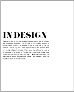
I would also say that my adobe skills have very much improved. I am especially comfortable and able on illustrator and indesign and I think that this is due to my own style and interests. I have found workshops, again, very helpful and they have taught me more about the software. However I think I have so much more to learn on all of the programmes and there is one I am particularly looking forward to learning ( Adobe Dreamweaver)  , I think that learning to more of the shortcuts on the keyboard would enable be to create designs more quickly and efficiently. I also feel that I need to try more with photoshop and this out of the three is the one I am most uncomfortable with.

My own individual intentions as a Graphic Designer
Again I think this coincides with my own interest within graphic design. And again I feel that I am starting to determine this.

Tuesday, 1 October 2013

Ten Successful Things

We had to list ten things we thought we had been successful at last year:

Our 10 Successful things: ( We came up with in a group of 8 )

  1. Learned the Screen Printing process
  2. Learned to work as and within a group
  3. Recognised own styles, strengths and aims
  4. The quality of work , especially in 'A Brief History Of'
  5. Confidence in presenting
  6. Confidence, and better feedback in critiques
  7. Improved work ethic and consistency
  8. Started applying theory (e.g. colour and grids)
  9. Learned software programmes
  10. Ability to generate ideas and resolutions faster
Our list as a year group:
  1. Presentation Skills
  2. Feedback
  3. Using Workshops, applying them in a brief
  4. Independence
  5. Research and Development
  6. Understanding Time Management
  7. Working In/ With Groups and Specialisations
  8. Self Confidence/ Motivation
  9. Theory/ Context
  10. Understanding Own Style

Tuesday, 28 May 2013

PPP1 Presentation


After presenting my presentation and seeing the other members of the groups presentation I felt that I had no done the best presentation I could of done and I felt that I had missed out a lot of information. Things I felt I should of done;
  • Made the presentation more visual
  • Included imagery that inspires me
  • Mentioned studios/ people that inspire me
  • More images of my own work
  • More imagery and information that was personal to me and what I like outside of work
  • Should of evaluated good and bad work I have created throughout the year
And for actually presenting I should of looked at the audience more, but I did keep to the time limit and I think I spoke clearly.

Studio Brief 2 Development Work


The final 'logo'
I liked this design as my final logo, I liked the range of weights it contained, and the type is formal yet stylish, I made the line longer in the middle and to me it almost represents a double page, something I love to look at and create.


Final Work

Pack...

I used black paper for my stock, as well as pearlescent stock to line the inside of the pack. I also used a lot of foiling, and foiled all my contents. I feel that the black on black is sophisticated and modern. I also like black and white design and so I feel my colour scheme is appropriate. I foiled as I felt it adds another texture, one that is quite glossy/ glamorous and so quite editorial, high end.   


Contents 
  • Concertina (& belly band)
  • Publication
  • Card

Presentation of Pack


Card 

Front

Back


Publication


Concertina