Friday, 22 May 2015

End of Module Evalutation

1.  What skills have you developed through this module and how effectively do you think you have applied them?


Throughout this module I feel that in the second half of the year I have really developed my confidence in my abilities and determination to get started in the design industry. I feel that my communication skills have really improved by the way I write emails and the responses I get back. I think that my presentation skills have also improved and the presentation of my work has and this has helped me in putting my portfolio together. I think that the fact that I have been offered a job at a place I want to be in a sector I am really interested in definitely shows that I have successfully applied the things I have learnt in this module this year.

2. What approaches to/methods of design production have you developed and how have they informed your design development process?

Three two approaches that I have changed in my design method and production, are firstly that I have pushed my digital design skills and I feel that in creating my own website for my work is evidence that I am becoming more confident in this field. Secondly learning about industrial printing has made me think about sending work away to be externally printed and this shows in my business cards which Magpie Press printed for me and I learnt that you get a higher standard of finish and it saved me time and hassle, I would never of been able to produce 250 cards on my own, or it would of taken a lot of time and so sending important things like that to an external source is a good idea and by doing this I learnt about selecting stock and foil etc. 

3. What strengths can you identify in your work and how have/will you capitalise on these?

As mentioned my business cards have been printed to a high standard and I will use these to promote myself and my knowledge of printing and stock. I also think that my portfolio has become a lot stronger thanks to advice I got on my placement and I will again use this to show my work and my skills to prospective employers. Another thing that has been a huge strength to me is my placement at D.S.Emotion which I did a full month at I think that doing a month meant I learnt a lot more than I would have in a month, I also enjoyed working there and learnt that the profession is for me, I will capitalise on this experience by using them as a reference and it has given me a step up in experience which others may not have had. 

4. What weaknesses can you identify in your work and how will you address these in the future?

I feel that a weakness in this module itself is my ability to keep up with the documentation I feel that I have fulfilled the modules purpose by doing things for myself professionally anyway and this is where my university side has lacked slightly. I am also disappointed that my branding is missing the actual cv's, letterheads and invoice that I hd printed on stock I had ordered and had organised, I think in general a weakness of mine is sometimes losing things or forgetting due to having lots of other things going on, I think in future I will spend more time to think about what I am doing and slow down a little. 

5. Identify things that you will do differently next time and what do you expect to gain from doing these?

Next time I would attempt to blog more effectively and regularly. I would also have liked to possibly engage more in exhibitions and lectures etc I think that this is a weakness of mine and I feel that I could of maybe met more people and seen some different things from doing this. 

Attendance-5
Punctuality-5
Motivation-4
Commitment-4
Quantity of Work Produced-3
Quality of Work Produced-4
Contribution to the Group-4
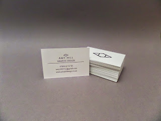
A Design Presence: Final Business Cards


I had my business cards printed at magpie press, one half uses the powder green stock (270 gsm) that I had bought previously and the other is natural white stock also 270gsm from the printers. The cards where duplexed and each has ben foiled with a black gloss foil. 

I am really pleased with the cards and I think that they are really suitable, I also like how they feel and I think that they feel more bespoke than an average card, as well as this the printing is almost perfect and as it has been foil the details have a slight debs which adds to the bespoke feeling

Thursday, 21 May 2015

A Design Presence: CV, Letterhead and Invoice

After looking at a few CV's I decided that mine would be very minimal in its design elements, I didn't want it to go form being too untraditional as it may put potential employers off reading it. 

I incorporated the identity style I had created by using stokes and a header and footer bar in the powder green. I also clearly defined each section by having an under and overlain the subject title in a capitalised font with space between the letters makes them stand out.

As for the design skills I marked myself out of five, I felt ten would be too many dots and they might of just become a blur. 


After designing my CV I moved onto my letterhead, which is an even more simplified format of the one above.

This provided the basis for my invoice, which has extra elements added into the page, this is so that the stationary is coherent and recognisable. 


The final stationary was printed onto a natural cream stock 135gsm, however when it came to photographing I could not find the stationary I had had printed and so I had to reprint onto normal 80gsm paper to have them ready! which was frustrating but the actual ones matched the other deliverables I had created.


A Design Presence: Website

For my website I chose to create it on wix as I heard that it was the easiest to use and that you could get the best deal on having your own domain and website with no adverts, which is the most appropriate as adverts look unprofessional and could be distracting.

I began by applying my own logo to the top of the page and choosing a minimal layout so that I didn't overcomplicate it for myself or the audience. 

I then added in my images and started labelling them.

I bought my domain name prior to my business cards as I needed them to have my web address on. I went for the name amyhilldesign.co.uk as some names had already been taken, and having design included gives the website a context. 


I did not have time to set the website up completely and so for submission purposes I will use screenshots and mockups to show my website, however beyond submission I will work on the website and publish it as soon as possible, and definitely before the end of year show where my business cards will be directing people to my website.


Wednesday, 13 May 2015

A Design Presence: Stock 2 and Printing

After initially ordering the stock from Shepards London, I realised I had ordered the green in two different shades, pistachio and powder, and in two different weights. 

And so I tried to email the company to see if they could help me and change the order, I had no response and the stock came the next day, and so I rang up and asked about the email and returning the stock, but it worked out that sending it back would cost more than the paper itself! 

And so I ordered more of the powder green in 270gsm as I had the 135gsm. I also ordered more natural white in 270gsm, some ebony black, and smoke grey, as the delivery cost is £9.50 so I ordered more this time. 

I am awaiting the delivery of the stock for print. 

I then had to find a method of printing I decided to ring Hobbs (Leeds) to see whether they could print on my stock, they said they can do this but if the printer jams they aren't liable, but they will always do a tester. And it should take around a day or two for everything to be ready for collection, and so I will be doing this as I know the ink/ printer quality will be high. 

I will wait for the stock to come and then take it to Hobbs with the jobs I need printing. 

I also found the colour value of the powder green online so that I could change green that will be printed to the same colour as the stock.


Saturday, 9 May 2015

A Design Presence: Logo Development

Logo Development

I began by looking at what my name looked like in different font styles and capitals or lowercase letters, 


Whilst doing this I looked at more abstract ways I could show my name as  had done previously. 


All the examples above where made in my spare time on my placement and I had feedback from some of the designers at D.S who said they liked the more abstract designs and they would work as a logo more. 

I left designing my logo for a while as I did not really like anything I had come up with. Taking on board what D.S had said and the fact I had learned a bit more about type etc I felt I could apply this advice and knowledge to my logo. 

I then tried making the letter of my first name into a pattern using Gahndi Sans which I had selected as the font I would be using.

I liked these visuals a lot more then the previous.


I decided that I like the A put on its side a reflected as my logo I felt it was simple and modern, I also felt that it reminded me of a two point perspective drawing which links to some of my interests and that it looks like there two different sides which could be print and digital. 


I then worked on the size and placement of the logo after I had worked on the type.


I felt that 'Amy' was a little informal and so I added my second name which balanced out the logo more and I felt that this worked, and it was appropriate to and for me.


Friday, 8 May 2015

A Design Presence: Stock 1

For the stock I wanted to order some stock that was more bespoke than the stock in the library. 

I was told about Shepards London by people in the studio, they sell colour plan stock the same as GF Smith but cheaper. 

When I went on the website, the colour plan was available in 135gsm, and 270gsm, so there isn't as much choice as GF Smith, not even considering special embosses or textures. 

However I didn't need this for my stock and I felt that 135gsm is suitable for letterheads, cv's, envelopes etc, and that 270gsm duplexed would be thick enough for a business card. 

It helped that I had a colour plan book from GF Smith with me whilst I was looking at the colours, for obvious reasons you can't really see the exact colour on screen. As well as this I had other stock sample books which let me feel the weights of the paper. 

I selected Powder Green and Natural White, and ordered sheets in 135 and 270gsm.